We are working on some merchandising stuff that we will sell in a short time through our website. The intention is to have high quality articles, with high attention to design, details, etc. We want these articles to reflect our philosophy and the way we do our work.
First article we are working on is a poster of our Moto2, the BOTT M210, printed in photographic quality paper at A2 size (around 587×413 mm or 23.14×16.29 inches).
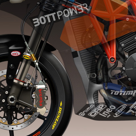
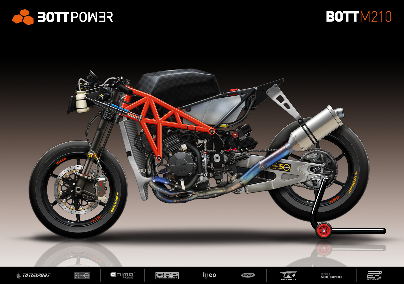
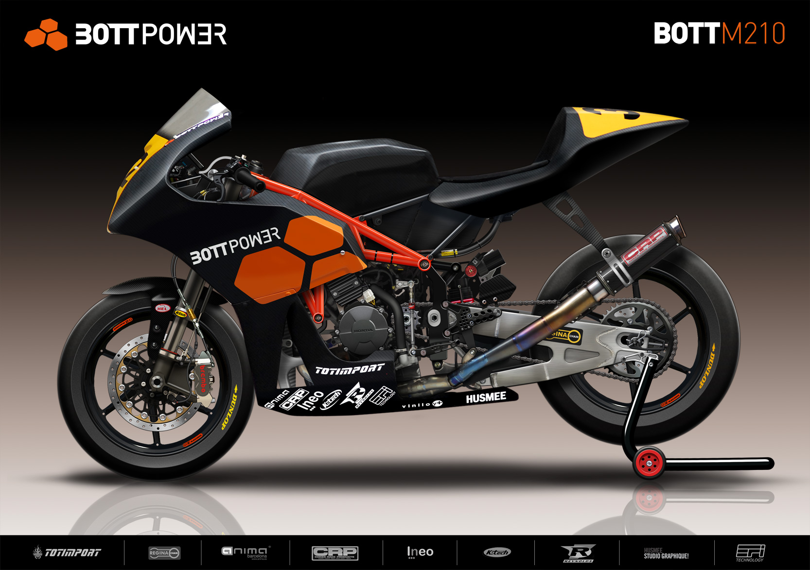
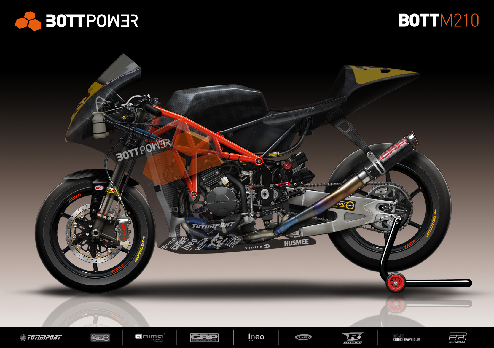
Images have high resolution and have been created by artist Russ Schwenkler, mixing 2D and 3D techniques, in such a way that it is possible to appreciate even the smallest details (like bolts or stickers). The motorbike of the image has a finishing level and a detail perfection that the real bike never will achieve.
We have 3 different images, if you click on each one you will see them at higher resolution.
The first one is the first prototype we tested, you can distinguish it mainly for the exhaust (we didn’t have the CRP exhaust yet). In this image the bike has no bodywork.
The second one is our current bike, with bodywork.
The third one is our current bike, with a semi-transparent bodywork that allows to see the chassis and the interior details.
The question is.. which version to you like more?
Hi David and the team,
I’ve been following the progress for about a year now and I have to say your work is fascinating. Keep up the good work!
First of all; these are some very nice images of the bike! From an engineering point of view I’d definitely go for the bottom picture with the transparent fairing. I really like the visibility of the details. The middle picture is more what the bike looks like in real life (I imagine) and the absence of the transparent features make it ‘easier’ to look at.
One vote for the bottom picture.
Best of luck for this season,
Luuk
Hi Luuk,
Thank you for your support and for your feedback with the poster.
There are not too many votes yet, but from the feedback we got from twitter and facebook, it seems that the transparent is the favourite one by the moment.
I agree with Luuk. The semi transpart version 3 looks the best to me – best of both worlds. It is a fine looking piece of kit with the CRP exhaust too – all very nicely rendered. Top drawer!
Pete
Image 3. Great to see the inner workings, along with the fully dressed bike.
Will we be seeing your frame in the Moto2 World Championships soon?
Cheers
JP
Hi Pete, thank you for your feedback with the posters and for your support with the Reynolds frame tubes!! We are very happy using Reynolds tubes in our frames. 🙂
Hi Jean-Paul, thank you for your feedback, it seems clear that semitransparent bodywork is the favourite one.
Regarding your question about World Championship, we have a step by step philosophy. So first our objective is to work to achieve top resoults in the CEV. If we achieve that and we find a good opportunity to go to theGPs we would think about it. The question is that we have seen how several projects started in GPs and after some poor resoults the projects were abandoned. We are not in a hurry about going to GPs, we only would think about that with a very competitive project, otherwise we think it has no sense to go there.
Image 3, closely followed by image 1.
Good luck with your CEV plans, especially a trouble free first few weeks.
Steve
The 3rd picture represents a very novel idea. Perhaps something using colored transparent or translucent plexiglass or lexan would be a good starting point.
One huge vote for image 1. My opinion is that the beauty really lies within the details only a pure race bike exhibits in the time and attention that engineers and designers spend on mainly hidden parts. We rarely get to see the completely naked versions in their full glory. Also, I don’t think you need the stand nor the gradient background. My preference would be to have a high contrast between the bike and background…much like the Solidworks(?) previews you have shown of the different parts. Simplicity and purpose, much like your bike, shows much better in my opinion.
Keep up the inspiring work!!